
December 25, 2025
The modern diner doesn’t discover restaurants on desktops—they find them on their phones, often while already nearby, hungry, and deciding where to eat in real time.
This shift has fundamentally changed how restaurants compete for attention. Being mobile-friendly is no longer enough. The restaurants that consistently win bookings, walk-ins, and direct orders are those that adopt a mobile-first mindset—designing their websites primarily for the phone, not shrinking a desktop site to fit a smaller screen.
A mobile-first website is not a trend or a design preference. It is a competitive advantage that directly impacts visibility, trust, and conversion.
Here’s how smart restaurants are using mobile-first websites to attract more diners and turn digital interest into real tables filled.
Today, dining decisions happen in moments—not sessions. Diners pull out their phones while walking, driving nearby, or sitting with friends deciding where to eat next. More than 70% of restaurant-related searches now occur on mobile devices, and those searches often signal immediate intent.
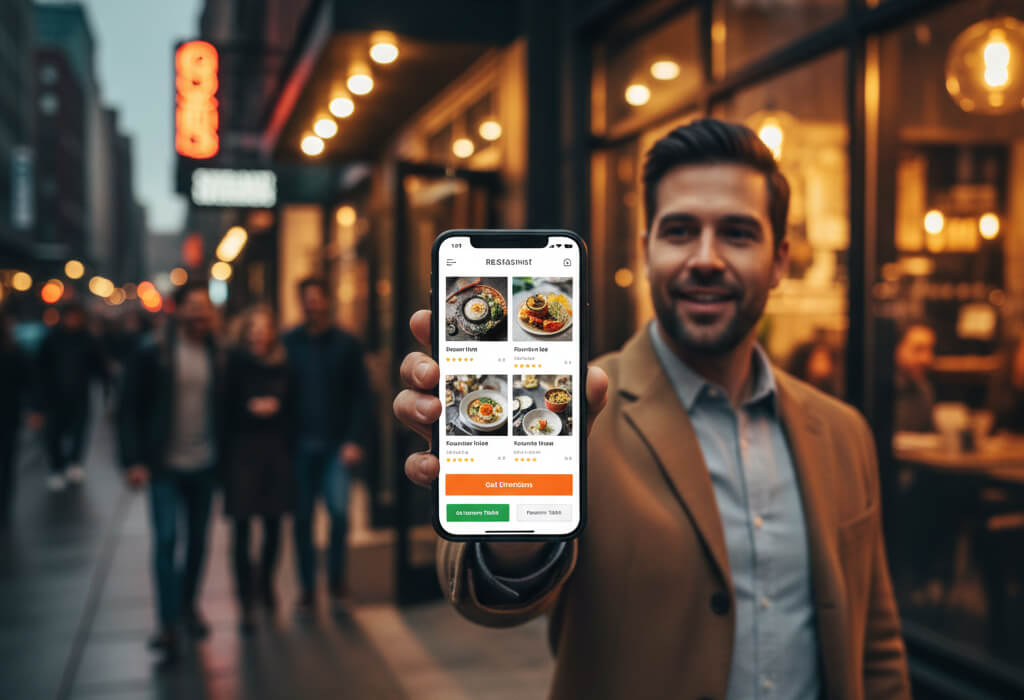
On mobile, diners want fast answers. They check menus to see if something appeals to them. They look for directions to confirm proximity. They scan reviews briefly for reassurance. Many want the ability to call, reserve, or order instantly without navigating multiple pages.
If a mobile website loads slowly, hides key information, or feels cluttered, diners do not troubleshoot. They leave and choose the next option in search results.
This behavioral reality is why mobile-first design is no longer optional for restaurants trying to stay competitive: Mobile-First Websites: Why Restaurants Can’t Ignore Them
Google evaluates restaurant websites using mobile-first indexing, meaning the mobile version of your site—not the desktop version—is the primary version Google uses to determine rankings.
This has major implications for local discovery. Restaurants with fast-loading, well-structured mobile websites consistently perform better in local search results. They appear more frequently in Google Maps, rank higher for “near me” searches, and capture more high-intent traffic from users ready to eat.
A mobile-first site sends strong quality signals to Google: speed, usability, clarity, and relevance. Desktop-first sites that perform poorly on mobile quietly lose visibility, regardless of how good they look on larger screens.
How mobile optimization connects directly to restaurant SEO:
When diners are hungry, patience disappears. Every extra second a mobile page takes to load increases the chance they abandon the site altogether.
Mobile-first websites are built with performance in mind. They use lightweight layouts, optimized images, and simplified navigation to ensure menus and key actions load almost instantly. This speed directly affects whether diners stay long enough to make a decision.
Restaurants that focused on improving mobile speed often saw noticeable increases in walk-ins, calls, and reservations—not because they changed their food, but because they removed digital friction.
Why even small speed improvements can lead to big traffic gains: How a Simple Website Update Can Double Your Foot Traffic
Desktop menus assume precise clicks and large screens. Mobile diners use thumbs, scroll quickly, and scan information in short bursts.
Mobile-first restaurants design menus specifically for this behavior. Text is large enough to read without zooming. Prices are clear and easy to compare. Items are grouped logically to reduce scrolling fatigue. Dietary labels and highlights help diners quickly find what suits them.
This design approach reduces friction and decision fatigue, making it easier for diners to commit before leaving the page.
Why mobile-optimized menus consistently outperform printed and desktop-first versions:
Mobile-first websites are built around action, not exploration. Instead of burying information, they prioritize what diners want to do next.
Features like one-tap calling, one-tap directions, and instant reservations reduce hesitation and remove unnecessary steps. When the path from interest to action is short, diners are far more likely to follow through.
This is how mobile-first websites bridge the gap between browsing and visiting, especially for spontaneous dining decisions.
How smart websites convert mobile visitors into paying diners: How to Turn Website Visitors Into Paying Diners
Trust is fragile on mobile. Small screens magnify clutter, confusion, and inconsistency. When a website feels chaotic or outdated on a phone, diners subconsciously question the professionalism of the restaurant itself.
Clean mobile-first design communicates organization, care, and reliability. Clear typography, consistent branding, and simple layouts reassure diners that the restaurant pays attention to detail.
This is why diners consistently trust official websites more than social media profiles when making decisions: Why Diners Trust Websites More Than Social Media Profiles
Directories, review sites, and delivery apps are optimized for their own business goals—not for the restaurant’s. They prioritize ads, competitor listings, and platform retention over direct relationships.
Mobile-first restaurant websites give owners full control over the customer journey. They highlight direct ordering, promote reservations without fees, and keep diners focused on the restaurant rather than distractions.
Restaurants that invest in strong mobile-first sites reduce dependence on third-party platforms while increasing profit margins and customer loyalty.
How restaurants are winning back control with better websites:
Restaurants that rebuilt their websites with mobile-first UX principles consistently outperform competitors who rely on outdated or desktop-first designs.
In one documented case, a restaurant increased bookings by 40% after improving mobile clarity, navigation, and speed—without changing its menu or pricing: How One Restaurant Increased Bookings by 40% With a New Website
The improvement came from aligning the website with how diners actually behave.
Smart restaurants no longer ask, “Does our website work on mobile?”
They ask, “Is mobile the best experience we offer?”
Because when diners are hungry, nearby, and scrolling on their phones, your mobile experience determines whether they choose your restaurant—or never notice it at all.
Win the phone.
Win the table.
Stay up to date with the latest tips, expert insights, product reviews, and step-by-step guides to help you grow, create, and succeed—no matter your industry or passion.