In the restaurant business, your food, service, and ambiance are central—but in today’s digital-first world, your online experience often determines whether someone ever walks through your door.
With more diners using smartphones and tablets to discover and evaluate restaurants, a mobile-first website isn’t optional anymore—it’s essential.
Here’s what “mobile-first” really means, why it matters more than ever in 2025, and how to get it right—so you’re not missing out on reservations, orders, and revenue.
What “Mobile-First” Actually Means
A mobile-first website is not just “mobile-friendly.” It’s designed with mobile devices as the primary audience. That means:
- The layout fits perfectly on small screens—no pinching or zooming.
- Navigation is simple and touch-friendly, with large buttons and clear menus.
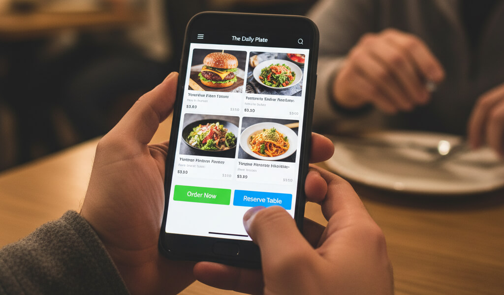
- Key actions—like viewing the menu, reserving a table, or ordering online—are immediately accessible, even on older or slower devices.
- The site loads fast, even on mobile data connections.
Only after the mobile experience is dialed in should the design scale up for desktop or tablet users.
Why Mobile-First Matters for Restaurants
1. Most Diners Start on Mobile
- Whether someone’s searching for “best pizza near me” or browsing Instagram stories, their first interaction with your restaurant is likely on a phone. Google reports that over 70% of food-related searches begin on mobile. Many of these are time-sensitive decisions—people looking for somewhere to eat right now.
- If your website is clunky or slow to load on a mobile device, they’ll move on in seconds.
2. Google Ranks Mobile Sites First
- Google uses what’s called mobile-first indexing, meaning your website’s mobile version is what it looks at when deciding how to rank you in search results.
- If your mobile site is:
- Slow to load
- Hard to navigate
- Missing key content or functionality
- …you’ll likely rank lower—or not show up at all in local searches.
- That’s a big deal, especially when you rely on being found in “near me” or “[cuisine] in [your city]” searches.
3. Better Mobile Experience = More Conversions
- The easier it is to take action on your site—reserve a table, place an order, call the restaurant—the more likely users will do it.
- In a mobile-first design:
- Call-to-action buttons (like “Order Now” or “Book a Table”) are immediately visible.
- Users don’t have to scroll endlessly or tap through multiple menus.
- Contact details, hours, location, and menus are front and center.
- Fewer taps = more diners choosing you.
4. Your Mobile Site Reflects Your Brand
- First impressions count. A slow, outdated, or broken website on mobile makes people wonder: If they can’t update their website, can they handle my food order?
- On the flip side, a fast, polished mobile site communicates:
- Professionalism
- Attention to detail
- Quality service
- It builds trust before a customer even steps through your door.
What Happens If You Ignore Mobile?
Let’s be blunt—not having a mobile-first website costs you real money.
Here’s what you risk:
- High bounce rates: People land on your site, struggle to use it, and leave instantly.
- Missed reservations and orders: Customers can’t (or won’t) fight with a broken booking or ordering system.
- Wasted ad spend: If you’re running social or Google ads but your landing page doesn’t work well on mobile, you’re throwing away clicks.
- Lost visibility in Google search: You won’t appear in local search results if your site fails Google’s mobile standards.
- Poor brand perception: People assume that a clunky online experience equals poor in-person service.
What to Focus On in a Mobile-First Restaurant Website
If you're building or updating your site, make sure you:
1. Prioritize Speed
- Mobile users are impatient. Your site should load in under 2 seconds. Use compressed images, minimize scripts, and enable caching to keep things fast.
2. Use a Responsive Layout
- The design should automatically adjust to fit different screen sizes—from the latest iPhone to an older Android. Everything should stay readable, tappable, and visually clean.
3. Design for Touch
- Use large, easy-to-tap buttons and menus. Avoid requiring users to zoom in or navigate tiny dropdowns.
4. Make Key Info Instantly Accessible
- Your homepage should immediately show:
- Menu (with prices)
- Hours of operation
- Address and Google Maps link
- Contact info
- Reservation and ordering options
- Don’t hide this behind multiple clicks or complicated navigation.
5. Use Mobile-Friendly Media
- Your images should be beautiful—but optimized for mobile. Avoid huge file sizes or autoplay videos that eat up data.
6. Plan for Offline Access
- If possible, allow diners to see a cached version of your menu or contact info, even with a weak connection. This can be a big win for users on the go.
How a Mobile-First Site Pays Off
A modern, mobile-first website directly increases your bottom line. Here’s how:
- Higher conversion rates from mobile traffic (more bookings, more orders).
- Improved reviews from satisfied customers who appreciate convenience.
- Increased return visits—people remember a smooth experience.
- More word-of-mouth and shares—especially if your site integrates well with social platforms.
Realistically, a mobile-first website can pay for itself in a matter of weeks. Just a few extra orders or reservations per week can offset the cost of development and continue to generate revenue long-term.
Want to dig deeper into the numbers? Check out: The ROI of a Restaurant Website: What Owners Need to Know
How to Get Started
Not sure where to begin? Here’s a simple process:
- Work with a mobile-first designer or platform
- Make sure whoever is building your site understands how restaurant users behave on mobile. Ask for examples.
- Simplify everything
- Less is more. Clear layout, large buttons, fast loading, and minimal distractions win on small screens.
- Test on real devices
- Don’t rely solely on desktop previews. Check how your site looks and works on different phones and tablets.
- Update regularly
- Menus change. Hours shift. Promotions evolve. Keep your mobile site up-to-date so people trust the information.
Final Thought
In 2025, mobile-first design is not a luxury—it’s the foundation of your restaurant’s digital presence.
If your current website is hard to use on a phone—or worse, if you don’t have one at all—you’re losing business every day. A well-designed mobile-first website builds trust, drives revenue, and helps your restaurant thrive in a world where the first impression happens on a 6-inch screen.
Start now: Run a free audit, review your user journey, and take action.
Need a checklist? Here’s one: The Ultimate Restaurant Website Checklist: From Menus to Mobile UX