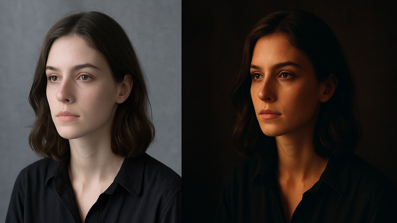
Color grading in photography is the artistic process of adjusting and enhancing the colors in an image to create a specific mood, tone, or atmosphere. While color correction focuses on achieving natural, true-to-life colors, color grading takes it a step further, adding emotional depth and storytelling to your images through intentional color styling.
Whether you're looking to build a consistent aesthetic for your brand, create cinematic wedding shots, or add drama to your portraits, understanding color grading is a game-changer for elevating your visual style.
Color Correction vs. Color Grading: What's the Difference?
Before diving deeper into color grading techniques, it’s important to distinguish between color correction and color grading:
- Color Correction: This is the technical process of fixing exposure, white balance, contrast, and colors to achieve a natural, balanced image. Think of it as the foundation of your image's color accuracy.
- Color Grading: On the other hand, color grading is the creative enhancement of those colors. It's used to establish a specific look, tone, or mood that aligns with the emotion or narrative you want to convey.
Explore the full breakdown in our guide: Color Correction vs. Color Grading in Photography
Why is Color Grading Important?
Color grading is not just for film or video production; photographers use it extensively to:
- Define a signature style: Consistent grading gives your work a unique, recognizable aesthetic.
- Evoke specific emotions: Whether you want to create warmth, tension, nostalgia, or calm, color grading can help you set the emotional tone.
- Enhance visual storytelling: Grading gives you control over how your audience perceives the scene, emphasizing key elements and guiding the viewer's emotional response.
- Create brand consistency: Color grading ensures that your portfolio, social media, or client work maintains a cohesive look, helping to strengthen your brand identity.
For example, whether you’re editing a foggy mountain shot with teal and orange tones or adding a subtle sepia tint to a black-and-white portrait, color grading allows for endless creative possibilities.
Tools for Color Grading Photography
You don’t need high-end Hollywood software to start color grading. The following tools are photographer-friendly and provide plenty of features for powerful edits:
- Adobe Lightroom: Offers HSL sliders, tone curves, and color grading wheels (shadows/midtones/highlights) for precise adjustments.
- Adobe Photoshop: Provides granular control through color lookup tables (LUTs), selective color editing, and gradient maps.
- Capture One: Known for its high-end color control and tethered shooting, popular among professional photographers.
- Mobile Apps: For on-the-go grading, try apps like Snapseed, VSCO, or Lightroom Mobile.
Want to grade like a pro? Discover the best editing apps in 2025.
Color Grading Techniques (Step-by-Step)
Here’s how to approach color grading, from start to finish:
1. Start with Color Correction : Before diving into color grading, ensure that your base image is balanced and clean. Fix white balance, exposure, and contrast so that the image looks natural and well-lit. This creates a solid foundation for your creative color enhancements.
2. Use the Color Grading Wheels : Most photo editing software (such as Lightroom and Capture One) feature color grading wheels for shadows, midtones, and highlights. These allow you to adjust the tones in different areas of the image to create a cohesive look.
- Warm tones (reds/oranges) can be added to highlights (think golden hour sunlight).
- Cool tones (blues/greens) can be applied to shadows for a moody or urban vibe.
- Adjust the blending and balance of the wheels to fine-tune how the different tonal regions transition between each other.
3. Manipulate HSL (Hue/Saturation/Luminance) : The HSL panel allows you to fine-tune the individual colors in the image
- Hue: Shift colors within the image (e.g., turn greens into teal or oranges into amber).
- Saturation: Boost or reduce the intensity of specific colors. For instance, you might desaturate reds for a more subdued, neutral look or increase the vibrancy of blues for a dramatic sky.
- Luminance: Adjust the brightness of specific color ranges. Brighten the yellows for a sunny feel, or darken the greens for a moody, darker look.
4. Use LUTs for Quick Stylization : If you’re looking to apply a specific look to your entire image quickly, LUTs (Look-Up Tables) are your best friend. These are preset grading styles that you can apply across your photos for a cohesive, stylized look.
Want consistency in your client work? Build your own preset library and save time while branding your look.
Tips for Better Color Grading
Here are some pro tips to help you get the best results with your color grading:
- Don’t overdo it: While it’s tempting to make dramatic color shifts, subtle adjustments often feel more polished and natural. Less is more.
- Match the mood to the story: Choose color schemes that reflect the emotions you want to evoke. For example, dark blue tones can convey calm or melancholy, while bright oranges can inject warmth and energy.
- Grade with purpose: Each color decision should have a reason behind it. Be intentional with your grading and how it enhances the overall narrative of the image.
- Use split toning sparingly: Split toning allows you to control the balance between warm and cool tones in the highlights and shadows. But be careful—not every image needs heavy split toning. Use it where it enhances the mood.
Examples of Color Grading Styles
Here are some popular color grading styles that can be applied to different types of photography:
- Cinematic: A classic look featuring teal shadows and orange highlights, often used in movies for a dramatic and cinematic feel.
- Vintage: Muted tones, lowered contrast, and warm, brownish shadows create a nostalgic, retro vibe.
- Editorial/High Fashion: Cool, desaturated palettes with high contrast and selective saturation for a more modern, edgy look.
- Romantic/Wedding: Soft pastels, warm highlights, and creamy tones for a dreamy, romantic atmosphere.
Love cinematic tones? Explore our guide to cinematic wedding photos.
Conclusion
Color grading is about much more than just making your photos "look good"—it’s about adding emotion and storytelling to your work. By learning to manipulate the color palette of your images, you can transform a simple photo into a compelling, visually stunning narrative that speaks to your audience on a deeper level.