
January 06, 2026
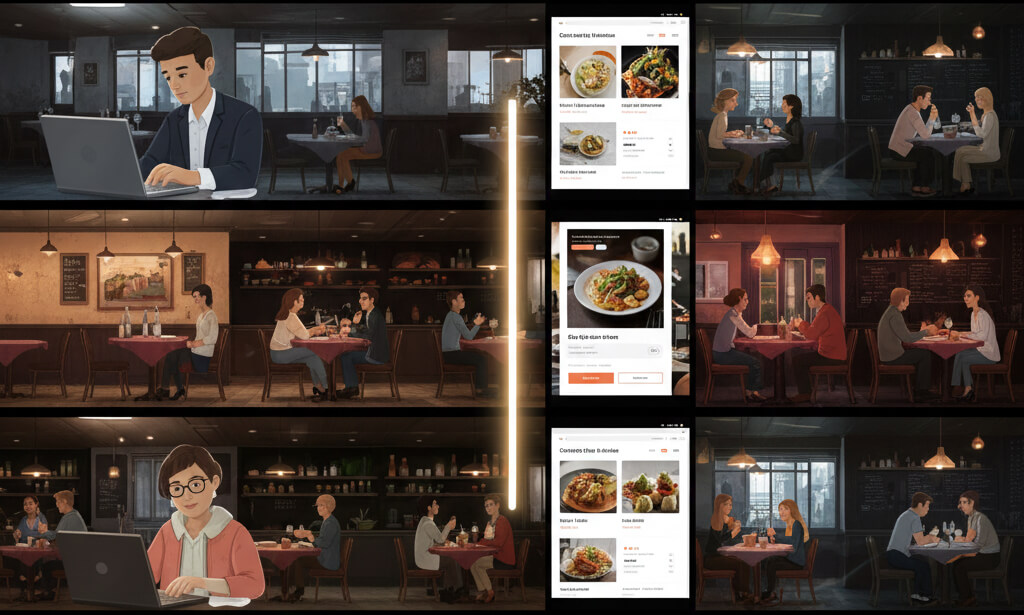
Many restaurant owners assume growth requires bigger budgets: paid ads, heavy discounts, influencer partnerships, or joining yet another delivery platform.
In reality, some of the biggest traffic increases come from something far less dramatic: fixing what’s already broken on the website.
No full redesigns. No ad spend. Just targeted improvements that remove friction from how diners find, understand, and choose a restaurant.
Below are five real-world restaurant scenarios where small website fixes led to measurable traffic gains, more walk-ins, and higher direct revenue.
The problem wasn’t traffic—it was confusion.
The café’s website looked modern, but it failed at the most basic job: answering questions quickly. New visitors couldn’t immediately see the menu, hours, or exact location.
From a diner’s perspective, this creates hesitation. From Google’s perspective, it weakens local relevance.
What they fixed:
Why it worked:
The result:
The problem wasn’t content—it was performance.
Analytics showed over 70% of visitors were on mobile devices, yet the site loaded slowly, menus were hard to tap, and navigation felt cramped.
Mobile users are often nearby and time-sensitive. Any friction causes abandonment.
What they fixed:
Why it worked:
The result:
The problem wasn’t demand—it was uncertainty.
The restaurant’s menu lived as a blurry PDF uploaded years ago. It loaded slowly, wasn’t mobile-friendly, and didn’t reflect current pricing or options.
Diners couldn’t confidently decide before visiting.
What they fixed:
Why it worked:
The result:
The problem wasn’t quality—it was inconsistency.
Despite a loyal customer base, the restaurant appeared sporadically on Google Maps and local search results. Business information varied across platforms.
Google couldn’t confidently rank it.
What they fixed:
Why it worked:
The result:
The problem wasn’t traffic—it was conversion.
Visitors were arriving, but bookings and visits lagged. The site lacked emotional reassurance.
What they fixed:
Why it worked:
The result:
These aren’t isolated cases.
One restaurant achieved a 40% increase in bookings simply by improving website clarity and user experience—without spending on ads.
That story is documented in How One Restaurant Increased Bookings 40% With a New Website.
No gimmicks. Just fundamentals done right.
These restaurants didn’t chase trends.
They didn’t increase spend.
They didn’t overhaul everything.
They fixed what mattered:
Sometimes, doubling traffic isn’t about doing more.
It’s about removing friction.
Fix the website. Let the customers in.
Stay up to date with the latest tips, expert insights, product reviews, and step-by-step guides to help you grow, create, and succeed—no matter your industry or passion.