
October 09, 2025
A restaurant’s logo is more than just a symbol — it’s a story, a promise, and a feeling condensed into a single image. From the golden arches of McDonald's to the sleek minimalist icons of modern eateries, the world’s most famous restaurant logos showcase the power of design psychology and storytelling. When done right, a logo becomes an unforgettable identity that speaks to customers on an emotional level.
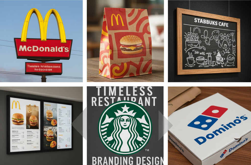
Few logos are as instantly recognizable as McDonald’s. The golden arches are more than just a design; they represent consistency, comfort, and global familiarity. Their success demonstrates how simple shapes and powerful color psychology can evoke a sense of trust. The arches create a subconscious association with warmth and comfort, which is key to the brand’s universal appeal.
McDonald’s is the perfect example of how minimalism and color can create instant recognition. The yellow symbolizes happiness and warmth, while the bold, curved shape of the arches invites customers in. This level of brand recognition is built through years of consistency, both visually and in product quality.
To see how design decisions, like simplicity and consistency, can affect your restaurant’s branding, read more in Using Customer Data to Make Smarter Menu Decisions. For those looking to improve their own branding strategies, consider design tools like Canva or Adobe Spark, which offer easy logo creation templates.
Starbucks’ twin-tailed siren logo is a masterclass in visual storytelling. Rooted in the brand’s nautical origins, the logo evokes a sense of discovery, adventure, and sophistication. The siren — a symbol of temptation — draws customers in, promising an experience that’s more than just coffee; it’s an escape, a ritual, and a journey.
The Starbucks logo is about more than just selling coffee. It encapsulates the brand’s story, inviting customers into a narrative of exploration and global connection. The siren represents the idea of an oasis, somewhere to relax and indulge — themes that resonate deeply with customers looking for more than a quick caffeine fix.
To understand how consistency across all customer touchpoints enhances your brand, check out Online Menus: Why They Matter More Than Printed Ones. For tools that help you create a memorable logo, consider using Tailor Brands or Looka, which specialize in creating logos that tell a story.
Domino’s logo is built on simplicity and clarity, with three bold dots that represent the original three Domino’s stores. But these dots also stand for speed, efficiency, and reliability — attributes that the company has worked hard to establish over the years. The minimalism of the logo makes it versatile and effective in both print and digital spaces.
The Domino’s logo is a great example of how simplicity can make a lasting impact. The clean lines and easy-to-read design ensure that the brand remains recognizable in every context, whether it's on a delivery box or a mobile app.
For a deeper dive into how local engagement and simplicity can reinforce your branding, read Why Restaurants Should Sponsor Local Events. Platforms like LogoMakr or Hatchful by Shopify are great options for creating clean, simple logos that speak volumes.
In the digital-first era, ghost kitchen brands like CloudKitchens and Reef Kitchens have redefined what a restaurant logo needs to do. Their logos are sleek, minimal, and optimized for screen visibility. This new wave of digital-only or delivery-first brands focuses on adaptability, ensuring that their logos look good on apps, websites, and even delivery platforms.
In the world of ghost kitchens, the simplicity of design is crucial for standing out in a crowded digital space. These brands are building recognition without a physical presence, relying on clean, modern logos that convey professionalism and trust.
For further insights into how digital-first brands are changing the restaurant industry, check out Ghost Kitchens Explained for Small Restaurant Owners. If you’re considering launching a digital-first concept, tools like MenuDrive or Square Online can help you set up a streamlined, professional online presence.
Whether you're running a family-owned café or a cloud-based kitchen, your logo is your restaurant’s first impression. It’s not just a mark — it’s the visual embodiment of your story, promise, and values. A successful logo should connect emotionally with your audience and seamlessly translate across both physical and digital spaces. When done well, it becomes more than just a symbol; it becomes an integral part of your brand's identity.
To craft a logo that tells your story and connects with your customers, you can use design tools like Fiverr for custom logos or 99designs for a professional touch. Remember, your logo should always be adaptable to every medium, from print to digital, to ensure a consistent brand experience.
With these insights and resources, you'll be well on your way to designing a logo that not only tells your restaurant's story but also sets the tone for the customer experience you want to create. A strong logo isn't just a design — it's the foundation of your restaurant's lasting identity.
Stay up to date with the latest tips, expert insights, product reviews, and step-by-step guides to help you grow, create, and succeed—no matter your industry or passion.