
October 01, 2025
In 2025, a restaurant website is far more than an online menu—it's your most powerful digital marketing tool. A well-crafted website boosts credibility, captures online traffic, and drives reservations and repeat business. To inspire your next redesign (or first build), we’ve compiled 10 of the best restaurant websites from around the world—and the practical lessons you can apply to your own.
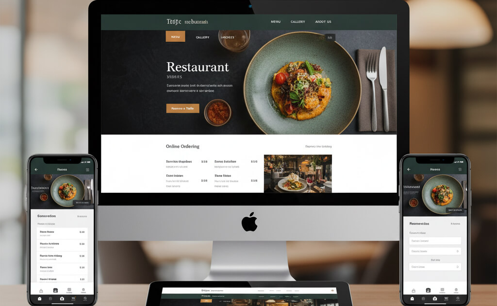
Why It Works: Clean, minimalist design that reflects the upscale dining experience. The homepage guides visitors straight to the reservation page with no clutter.
What You Can Learn:
Why It Works: Uses bold, full-screen visuals and a clear booking CTA with Tock integration for seamless reservations.
What You Can Learn:
Why It Works: The site opens with a cinematic video that captures the atmosphere and artistry of the dining experience.
What You Can Learn:
Why It Works: Emphasizes story and philosophy over hard selling. Imagery and layout are rustic, organic, and immersive—mirroring their brand.
What You Can Learn:
Why It Works: High-impact visuals, concise layout, and an energetic brand voice make it instantly engaging.
What You Can Learn:
Why It Works: Bright, bold, and proudly quirky. This site uses humor, rainbow visuals, and unique voice to match its in-store experience.
What You Can Learn:
Why It Works: Sleek, black background with striking food photography, paired with modern typography for a premium feel.
What You Can Learn:
Why It Works: Integrates a brand story (“by farmers, for everyone”), beautiful visuals, and sustainability messaging.
What You Can Learn:
Why It Works: Playful color palette, easy scrolling experience, and warm photography create a cozy, inviting digital presence.
What You Can Learn:
Why It Works: Features a unique split-screen layout with intuitive navigation and bold food visuals.
What You Can Learn:
These standout websites succeed because they prioritize user experience, visual storytelling, and streamlined functionality. Here are the common threads:
Want a detailed, step-by-step blueprint to follow? The Ultimate Restaurant Website Checklist: From Menus to Mobile UX
The best restaurant websites don't just look good—they convert visitors into customers. Whether you’re a Michelin-starred fine-dining spot or a cozy neighborhood café, your website should:
Take inspiration from these world-class examples, then tailor your site to match your own brand and guest experience.
If you’re ready to improve your site, use this website checklist as your starting point.
Stay up to date with the latest tips, expert insights, product reviews, and step-by-step guides to help you grow, create, and succeed—no matter your industry or passion.